Oldboy, Design, and the Gravest Mistake

“Your gravest mistake wasn’t failing to find the answer. If you keep asking the wrong questions, you’ll never find the right answer.” – Lee Woo-Jin, Oldboy, 2005

Oldboy is a fantastic film from South Korean director Park Chan-wook. Shown at Cannes in 2004, it saw a wide release in 2005 and is currently being remade (and Westernized) by Spike Lee. However, this isn’t a story about a movie. This is a story about a designer, mistakes, and lessons learned.

The story of Juan Luis Garcia, a designer from Los Angeles, California, blew up the twittersphere after he posted an open letter to Spike Lee over the treatment he received after being asked to do spec comps of key art posters for the Oldboy remake. Garcia says he was approached by an unnamed design firm and asked to create these designs, became a bit star-struck at the fact that Spike Lee was involved, and got mistreated and taken advantage of by said design firm. For fear of mistelling, I don’t want to get in to too much detail, so visit his site to read his open letter here: http://juanluisgarcia.com/dear-spike-lee/

I read the letter and I became angry for Juan. He was mistreated and that is an awful thing that hurts the industry. However, I cannot say that I have sympathy for him. He failed to protect himself from these sorts of things leaving him vulnerable. Most notably:

“We never signed any contracts or work-for-hire agreements…”

I’m honestly getting tired of hearing sad stories of designers who didn’t get paid or had people take advantage of them and then reading a sentence similar to this in their story. The most simple, basic thing you can do to protect yourself is to always have a contract. Always. There’s nothing more that can be said on the issue. Have something legally binding in place to protect yourself. If the person who wants to work with you isn’t willing to have one, you don’t want to work with them. Moreover, be willing to enforce it. A contract is just a piece of paper unless you’re willing to enforce it. If you’re not willing to do so, you may as well just wrap old gum up in it to throw it out. So, for those of you who are surely out there saying “Well, I had a contract and still got screwed over.” Did you enforce it?

Why wouldn’t someone enforce a contract? It would seem that having a legally binding document in place to protect yourself would be beneficial to you as a designer. It’s because there are designers that don’t realize what kind of power they have. Like Juan said…

“I couldn’t take another condescending phone call because I was ‘only a designer.”

They approached YOU to design something for them. Do you not see the hand that you have in this situation? In this kind of situation, it’s important to realize that you’re not working FOR them, you’re working WITH them. Stand up for yourself and do the right thing (pun not intended). Have a contract, enforce it, and don’t be afraid of a firm that tries to intimidate you for doing so. Are you scared of losing work? Oh, you mean all this spec work that will ruin your life and probably leave you unpaid? Why would you ever want to lose that? Good firms will not mind you having a contract because they realize the protect it provides you and them and it’s just good business.

Again, I’m angry at what happened to Juan Luis Garcia, but it could have been avoided. In a perfect world, every business relationship would be great. There would be no one trying to take advantage of other people’s work and we wouldn’t have to worry about having things stolen from us. However, this isn’t a perfect world. This design firm is seemingly full of scumbags who really mistreated Garcia. I hope he gets the recognition he deserves from his work but I also hope he learned something from all of this.

BTW Juan is a really good designer. Check out his work on his portfolio website.
Failure to Launch: What healthcare.gov Teaches Us About Design

There is a problem with Obamacare. Not necessarily within the program itself. I’m going to try to stay as unbiased as possible when it comes to that. The problem was with the website. Overloaded, unresponsive, and generally broken, healthcare.gov burst into the world as the digital face of Obamacare. Who is responsible? Republicans? Democrats? Neither. Blame for this fiasco falls solely into the lap of CGI Federal, the company contracted to create this site. When I first heard of and saw all of the problems, I was angry but when I saw coverage of the hearing, I became furious. It became abundantly clear that CGI Federal was not operating with the best interest of the most important thing about a website in mind.

The most important thing about a website isn’t the photos. It isn’t fancy animations, pretty typography, or even the content. The most important thing about a website is the person using it. We make websites for people to use. All of the other elements should be tailored to meet that end. Without people using your site, you’ve just created digital noise. Putting out a broken product alienates users. Digital noise.

You might say “They couldn’t help it. They had a deadline to meet.” No. It was their responsibility, their duty, to put out a good, usable product. Sometimes, it has to just not be ready yet. Instead of just bidding to try to get a contract, create a responsible bid where your client can get the best product. At the very least stand up and say that there is a problem and there’s more work that needs to be done. Pushing out a broken product, especially evident in this case, is irresponsible, greedy, and bad business.

Designers have a lot of power. Designers have the power to change the world. If you believe in something enough to take the job and work on it, make sure you are creating a product that you can stand behind and reflects the belief you have in what you have done. If you don’t believe in it, don’t do it. healthcare.gov should have been reflective of all the good that the program could do. It wasn’t.

Do this as a reminder. Go to healthcare.gov and take a screenshot. Print that out and put it on the wall beside your computer. Whenever you’re working on something, look at it and ask yourself “Am I doing work I can be proud of?” This fiasco is one that designers should remember and take to heart. Don’t forget. You have power, use it wisely.

Design and Relationships (Part 1)

As I was writing this, I realized that it had gotten really lengthy and wordy. So, I decided to break this up in to a two part entry. Part two will be posted at a later date.


Relationships are difficult. I think that is a universal truth of life. By extension, a good relationship is that much more difficult. When I find myself thinking about design and how to better relate the process to my life, I often times consider how similar good design is to a good relationship.

1. Good design requires passion
Recently, I read on the Huffington Post that one of the main reasons for divorce in America is that the couple isn’t willing to fight for their relationship. There’s no spark, no drive, no passion to try to make things work. It is a clear law of the jungle that you have got to be willing to fight to survive. You have to have that same passion toward your work and be willing to fight for it when the situation arises.Some people will say that it is best to not make such a personal investment in your work. Those people are doing it wrong. Be willing to fight for your work and what you know is good. No one else can fight for what you do better than you can. It’s important to remember, though, that too much of this is a bad thing also. You can’t get so wrapped up in what you do that you become conceited, difficult to work with, or contentious. It’s is also important to be able to set boundaries to keep you as someone people want to work with so you can maintain an income.

2. Good design requires boundaries
To keep a healthy relationship, you have to have proper boundaries with your significant other. If you don’t have boundaries, you’re destined for codependency and lose your individual identity. Very unhealthy. You’ve seen these couples out in public; wearing matching outfits and calling each other pet names. They can’t see anyone but each other and that’s the biggest potential problem for a designer that doesn’t set boundaries. It sounds kind of strange to say that someone can become codependent with the work they do but it is an altogether possibility. You’ve also seen those designers out there that have become so wrapped up in their own work that their vision becomes myopic.You have to understand that you’re not always working for yourself and what your client wants or needs is not what you had in mind. The lack of boundaries lends itself to the so-called “Dribbble Culture” where getting one’s ego stroked takes precedence to actual problems that need to be solved. Design is about solving problems within constraints. Stand for what you know is good or right, but also understand that constraints are necessary and constant and are not a personal attack on who you are as a person.

The Problem with Dribbble Culture

I recently read an article about what they called “Dribbble Culture.” For the uninitiated, dribbble.com is a website where designers can post all or a small portion of something they’re working on for critique or just to show off. Or that’s what it is supposed to be, in theory.

Before I really get in to this, I feel like I need to preface things by saying that I like Dribbble. If employed properly, it can be a great resource for designers. It would probably be a better tool if no one else could rate specific designs. The whys of that I will, hopefully, explain later.

The point of the article, a point I agree with, is that the social community of Dribbble places the emphasis on the wrong thing when it comes to critiquing and rating design. How does this come about? The thing about Dribbble is that you have to be invited to be able to post your work and the invitations come from the people who are already approved, active members of the site. In doing that, the site creates a sort of class system that lends itself to the formation of this culture. You have to comment and review in order to get attention and increase the likelihood of receiving an invite. Moreover, you get the impression that you have to leave positive, or even flattering, comments because whether or not you get the invitation is in the hands of the people you are commenting on. It’s hard to be really critical in this sort of situation.

Moreover, the only thing you ever get to see is a screenshot or a portion of a screenshot of the design you’re looking at. You have no idea of how the design actually works in context or if it meets the goals of the client. This means that any critique that could be made is superficial. Now, there is something to be said for aesthetic critiques. One of the biggest problems that you have to solve, as a designer, is getting someone to look at your design and to keep them looking. Aesthetics are important but it can only take a piece so far in terms of how well it can accomplish the desired goals. When you boil the entire issue down, you’re left with a community of individuals offering overwhelmingly positive but superficial critiques in an attempt to “make friends” with the people they are critiquing in order to get an invite so they can be a part of something. It is potentially damaging and manufactures trends based on community interest instead of proven theory and concept.

So, then, if an environment that is built around vastly positive, superficial comments is harmful to design, what do we need to do to fix it? In the case of Dribbble, I feel it would be much more beneficial to have a forum where one could present case studies of the work, instead of a small screenshot. Then the work would be better represented in context and would offer more insight as to why decisions were made. Moreover, get rid of the “like” button. I realize that it’s the hip, social thing to do now (thanks Facebook) but the like button is totally non-committal. A “like” button can be clicked with very little motivation or forethought and should not really be used as a metric for how good something actually is in the real world. If you couple that with a third-party “jury” type system that distributed the invites based on quality content in comments/critiques, you would have a much better system for a design community site like Dribbble.

Again, I should say, that I like Dribbble. I like to peruse the different work that is out there and just “ingest” as much as possible and Dribbble is a great place to do just that. You get to see a wide variety of work from many different artists in a matter of moments. However, the community that Dribbble creates has the potential of damaging, or at least watering down, the profession. With a little modification, however, it could become a much better resource.

Why The Robot Created Font Isn’t A Robot Created Font

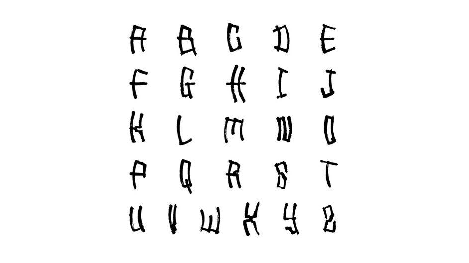
Robosans by Mostafa El Abasiry

Picture 1 of 1

‘Robosans’ is a so-called robot created font from Egyptian designer Mostafa El Abasiry. It was created by putting a brush in the arm of a robot. The artist controls the, albeit limited, movement of the arm via a controller wired to the robot. This controller is the hinge of why the “robot created font” was not created by a robot.

I have a wired controller hooked up to a robot in front of me right now. It’s called a mouse and it interfaces with my computer. While what I can do with it is limited, I’m able to use it to input to my computer to create fonts, images, and other graphics. I would not, under any circumstances, refer to my computer as the ‘designer.’ Not unlike the ‘robosans’ font. The robot used to create ‘robosans’ is just a tool utilized by the artist as a means to an end. At the end of the day, it’s still the hand of the artist that moves the robot. No artificial intelligence was used in the creation of this font and you can tell based on the look of the font.

While a robot was used in the production of the font, the soul of the artist is apparent. The lines of the font seem organic in appearance and its grittiness and style reminds me distinctly of certain types of graffiti. Very not robotic. There used to be a machine in Wal-Mart that I thought was pretty cool when I was a kid. Way before home computers and printers were a really big thing, there was the Hallmark custom card machine. You would select your card template and customize with names and little markers would pop out and ‘draw’ your card for you in front of your eyes. I recall this story because I was thinking about the quality of line that the card machine created. It was really precise. The kind of thing you would expect from a robot. Which is completely in contrast to what you get from the ‘robosans’ font.

Now, is that to say that ‘robosans’ is a bad font? Absolutely not. I’m just saying that calling it ‘robot created’ is taking it too far. I really like this font and can see it being really useful for headlines in modern design. I would like to give a great deal of credit to Mostafa El Abasiry and much less credit to his robot. Mostafa made an excellent font.

Read more about ‘robosans’ on designboom.com